
project overview
Under Armour views itself as a fitness forward brand that specializes in serving the needs of the elite athlete. To that point, elite athletes have very little need for an everyday run of the mill fitness tracker. That’s where HTC steps in. We worked with Under Armour to concept and build a fitness tracking ecosystem that could be built upon and added to based on your level of athleticism.
The foundation of this ecosystem is Healthbox, which is a product included three unique pieces of hardware and one piece of powerful software to connect it all.
my role
Working as the UI leader in this project, I led one UI designer to create all visual screens, reviewed with stakeholders and provided assets/measurements for the implementation.
In the meantime, I was the key person in charge of communication with the UX designer located in the US. The UI designer and I refined lots of versions of the design to fully support the UX designer discussed with Under Armour. We also worked with animators to create mockup motions utilized on the band and the scale.
Bands - Making lo-fi beautiful
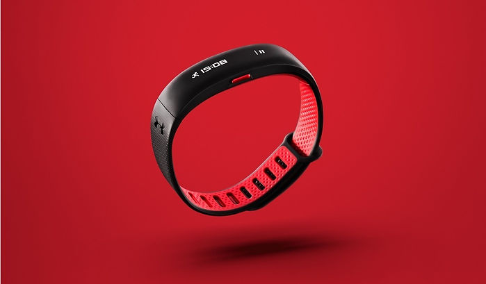.jpg)

To make a device looked seamless, the screen is placed under a thin film which created some challenges for legibility at first. The solution was to design a custom bitmap font and icons with zero anti-alias to counteract the bloom effect. I cooperated with the font designer from a third party directly to adjust the font details to ensure the digit-style font can perfectly be shown on the band and the scale.

The other challenge was finding a way to accommodate a rich feature set within a compact form. Our LCD panel had a 128x16px of workable resolution. Thus, we simplified the IA to 2 layers and maximized space by designing custom type and iconography. We also delivered a design system that supported five unique interactive regions and dozens of features within a very limited space.
Scales - An exercise in simplicity

The Scale was a new design challenge because we had to create a system that was easy to navigate with users’ feet. Our solution was to simplify the features and add an info loop that would cycle through stats without the need for touch interaction.
We also created a typeface for a custom dot matrix display made of super bright yet efficient LED lights beneath a single sheet of frosted glass.
UI design guideline
We defined UI Design Guideline for wearables and scales to ensure design consistency and standards. A great UI Design Guideline can save a lot of efforts on production design and can be a clear blueprint to well communicate with the engineering team.

Parts of UI Design Guideline